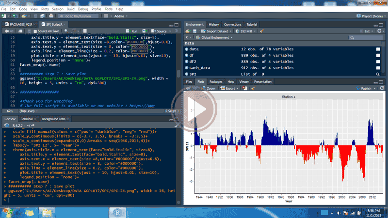
Calculate and plot SPI in r using ggplot2
Standardized precipitation index (SPI)
The WMO has adopted the standardized precipitation index (SPI) to be used by meteorological and hydrological services worldwide to characterize droughts. The SPI is based solely on precipitation data, not considering other variables (such as temperature, relative humidity, evapotranspiration, etc.). It is being used in research or operational mode in more than 70 countries (WMO).
The SPI is an indicator that can be calculated at various time intervals. The selection of the number of months is made based on the research objectives. Shorter durations will be significant for agronomic studies, whereas longer durations will be more suitable for addressing hydrological issues (Guttman 1999). According to the SPI values, drought starts when the SPI value is equal or below -1.0 and ends when the value becomes positive.
Calculate and plot SPI using ggplot2
In this course, I will show you how to calculate and create an SPI plot in R using the ggplot2 package. You can use the script below, and, watch the video to understand the steps involved in creating the SPI plot.
Step 1: Run the packages used
library(ggplot2)
library(openxlsx)
library(zoo)
library(tidyverse)
library(SPEI).
Step 2: Open data from excel file
data=read.xlsx("C:/Users/AE/Desktop/DATA GGPLOT2/SPI/Data.xlsx",
sheet = "Rainfall_data",
startRow = 1,
colNames = TRUE,
detectDates = TRUE)
head(data)
Step 3 : Data organization using the gather function
The gather function can be used to gather a key value pair across multiple columns.
Gath_data <- data %>% gather(Year, p, "1940":"2015")
head(Gath_data,12)
Step 4 : Calculate SPI based on the selected duration
SPI <- spi(Gath_data$p, 24)
SPI
Step 5 : Built a data frame (df)
Built a data frame (df) with time series of the fitted values and created a fill condition for positive (pos) or negative (neg) values.
df <- zoo::fortify.zoo(SPI$fitted)
names(df) = c("ID", "SPI")
df <- df %>%
dplyr::select(-ID) %>%
dplyr::mutate(Period = zoo::as.yearmon(paste(Gath_data$Year,Gath_data$Month ),"%Y %m")) %>%
dplyr::mutate(sign = ifelse(SPI >= 0, "pos", "neg"))%>%
mutate(Name = paste(Gath_data$Station))%>%
na.omit()
head(df, 12)
Step 6 : Plot SPI from df using ggplot2
ggplot(df) +
geom_bar(aes(x= Period, y= SPI, fill= sign), stat = "identity") +
scale_fill_manual(values = c("pos"= "darkblue", "neg"= "red"))+
scale_y_continuous(limits = c(-3.7, 3.5), breaks = -3:3.5)+
scale_x_continuous(expand=c(0,0),breaks = seq(1940,2015,5))+
labs(y= "SPI 24", x= "Year")+
theme(axis.title.x = element_text(face="bold.italic", size=8),
axis.title.y = element_text(face="bold.italic", size=8),
axis.text.x = element_text(size =8,color="#000000",hjust=0.6),
axis.text.y = element_text(size = 8, color="#000000"),
axis.line = element_line(size = 0.2, color="#000000"),
plot.title = element_text(vjust = - 10, hjust=0.01, size=10),
legend.position = "none")+
facet_wrap(~ Name)
Step 7 : Save SPI Plot
ggsave("C:/Users/Desktop/SPI/SPI.png", width = 16, height = 4.5, units = "cm", dpi=300)
Video : Calculate and plot SPI in r using ggplot2
Watch the video on YouTube
